
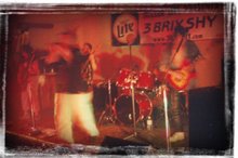
 I really like this photo, but today I reminded myself of the neat things I can do with my fairly simple Adobe PhotoDeluxe Home Edition 3.0 software when I took a sharp, new digital color photo and turned it into a simulation of a grainy, aged sepia-tone photograph. I decided to try to do the same thing here.
The first step was to desaturate the image. I didn't do it all the way, because I wanted to have a hint of color to play with in later steps.

I then modified the dominant color into something much more amber, by playing with variations that made the image more yellow and more red.

I desaturated again, added noise (monochromatic noise, using a Gaussian distribution), and played with the lightness, brightness, and contrast.

I repeated these steps several times until I had something that looked pretty close to the image I wanted.


After I had it where I wanted it, I used the Extensis Photoframe tool to simulate some edge damage in the photo.

I actually applied two of these frames, with the second flipped horizontally and vertically relative to the first and then skewed by a few degrees.

Next I created a border, which, since it is white, is only apparent if you select this image. I did this by increasing the "canvas size" uniformly in both the horizontal and vertical directions.

Next I "aged" this border by yellowing it slightly.

To add verisimilitude, I included a note in the lower margin. The font I used is Akbar, which replicates the lettering of Matt Groening in his Life In Hell comic strip. I stretched and skewed the text a bit. The color is blue-black.

Next I saved this image as a jpeg. This is because there are ways you can manipulate an image layer that you cannot manipulate a text layer. So I saved it as a jpeg and reopened it for more manipulation. I then smudged the text area somewhat, added a little more noise, and used the Soften tool to soften the entire image.
 And that was that. Here is the finished image:
Not bad for a half-hour's effort.


No comments:
Post a Comment